Artisan Chocolatier Company, Packaging
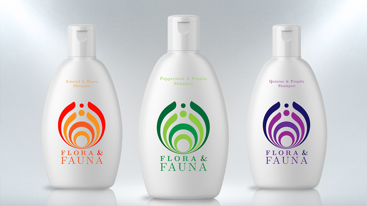
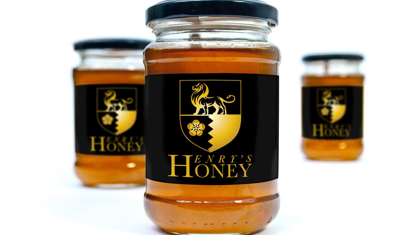
For this packaging design brief, I aimed to deliver striking, modern designs which standout from the crowd and which are also inspired by the countries of the cocoa’s origin as requested by the client. After researching the ‘high-end, artisan, chocolatier market’ I found a lot of the designs divided the already rectangular shape of the packaging into two or more smaller rectangular sections and/or used various wallpaper type patterns throughout. To completely avoid this look, I made my packaging as minimal and simple as I could making as much use of white-space as possible. I then used one illustration inspired by tribal face-masks of the country in question as the focal-point, incorporating the nation’s colours into the illustration. Finally, including the company name in the packaging design as requested.


