Henry's Honey, Logo and Packaging
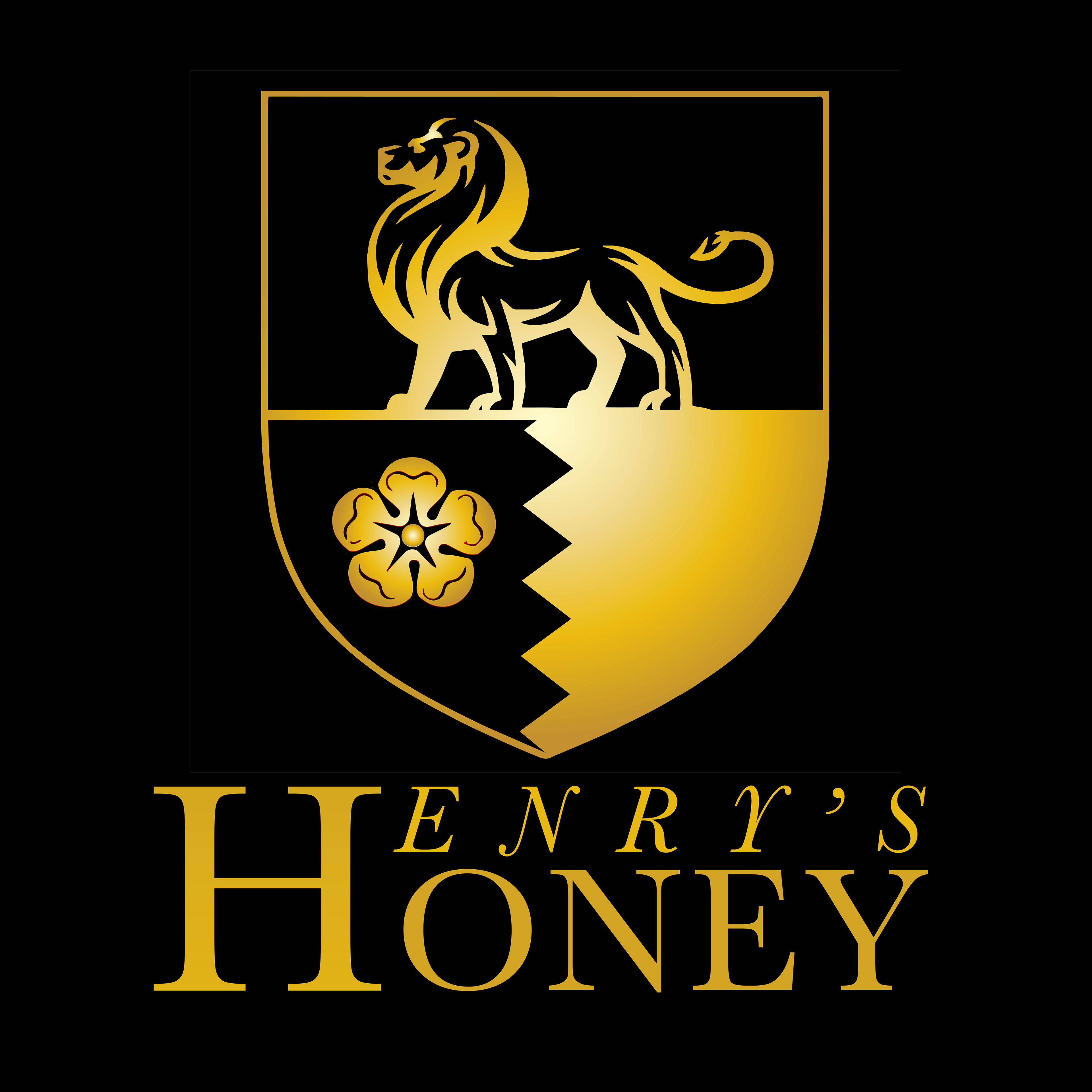
For the Henry’s Honey Label design, in order to create a design for the high-end, premium British brand that would “intrigue customers and stand out on the shelf” as requested by the client, I avoided focusing on the imagery associated with honey, such as bees, beehives, hexagonal shapes, flowers etc. used by most brands on the market. Instead focusing on the surname Henry. I took the traditional British, Henry surnames ‘coat of arms’ which has a lion and a flower and simplified and modernised it. Then combined it with clean, modern, simple Serif typography. For the label I then went with the ‘less-is-more’ approach as requested by the client, and placed only the essential element of the logo on a simple black background to contrast the logo's gold coloured gradient fill.
